Spark Design System
Spark Design System
Spark Design System
A full-stack design system overhaul. New token architecture, dark & light themes, independent modules for AI experience, and a framework integration strategy to close the design–dev gap for good.
A full-stack design system overhaul. New token architecture, dark & light themes, independent modules for AI experience, and a framework integration strategy to close the design–dev gap for good.
A full-stack design system overhaul. New token architecture, dark & light themes, independent modules for AI experience, and a framework integration strategy to close the design–dev gap for good.


The older design system served us well but revealed growing friction that compounded with every product release.
The older design system served us well but revealed growing friction that compounded with every product release.
The older design system served us well but revealed growing friction that compounded with every product release.
The current aesthetic feels dated against the competitive AI landscape and no longer reflects brand maturity.
Organic growth introduced hardcoded components that bypassed the token system, creating inconsistency and painful upgrade cycles.
Engineers built UI scaffolding (accessibility, focus management, animations) by hand, sacrificing velocity on work that commodity frameworks solve out of the box.
In development
Product Designer for Spark DS across Figma and Storybook ecosystems.
Product Designer for Spark DS across Figma and Storybook ecosystems.
Product Designer for Spark DS across Figma and Storybook ecosystems.
Tools used:
Tools used:


Research & Exploration
Research & Exploration
Research & Exploration
We started with mood boards and component explorations to define a scalable design language aligned with Egnyte’s evolving AI-driven ecosystem. Components were designed using semantic variable tokens in Figma, then tested directly in local Egnyte environments using Claude Code to validate behavior across workflows, themes, and adjacent UI patterns.
The system evolved through close collaboration with developers, including cleanup of legacy hardcoded components, framework integration discussions, Storybook reviews, and AI-assisted markdown documentation defining component usage, behaviors, and implementation guidelines.
If you'd like to discuss the design thinking, research, or design decisions behind this project, let’s connect.
We started with mood boards and component explorations to define a scalable design language aligned with Egnyte’s evolving AI-driven ecosystem. Components were designed using semantic variable tokens in Figma, then tested directly in local Egnyte environments using Claude Code to validate behavior across workflows, themes, and adjacent UI patterns.
The system evolved through close collaboration with developers, including cleanup of legacy hardcoded components, framework integration discussions, Storybook reviews, and AI-assisted .md documentation defining component usage, behaviors, and implementation guidelines.
If you'd like to discuss the design thinking, research, or design decisions behind this project, let’s connect.

Key Design Decisions
Key Design Decisions
Key Design Decisions
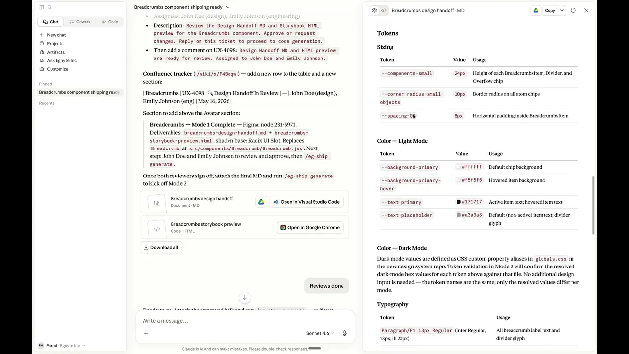
1 | Semantic tokens from day one in figma library.
1 | Semantic tokens from day one in figma library.
1 | Semantic tokens from day one in figma library.
Problem: DS 2.0 tokens were not created using variables, making dark mode impossible to add cleanly.
Problem: DS 2.0 tokens were not created using variables, making dark mode impossible to add cleanly.
Decision: All tokens in DS 3.0 are semantic: background/primary, text/secondary, border/default. These map to theme-specific raw values via Style Dictionary: one token, two themes, zero duplication.
Decision: All tokens in DS 3.0 are semantic: background/primary, text/secondary, border/default. These map to theme-specific raw values via Style Dictionary: one token, two themes, zero duplication.
Why: It's an infrastructure decision, not a naming preference.
Why: It's an infrastructure decision, not a naming preference.

2 | Adopt a headless UI framework to own the style, not the behaviour.
2 | Adopt a headless UI framework to own the style, not the behaviour.
2 | Adopt a headless UI framework to own the style, not the behaviour.
Problem: Every component required bespoke accessibility, focus management, and portal rendering, slowing delivery and producing inconsistent quality.
Problem: Every component required bespoke accessibility, focus management, and portal rendering, slowing delivery and producing inconsistent quality.
Decision: shadcn/ui as a structural foundation. DS owns all visual styling via tokens; the framework handles all interaction and accessibility logic.
Decision: shadcn/ui as a structural foundation. DS owns all visual styling via tokens; the framework handles all interaction and accessibility logic.
Why: Estimated 30–40% reduction in build time. Accessibility comes with framework, and engineers focus on DS-level styling
Why: Estimated 30–40% reduction in build time. Accessibility comes with framework, and engineers focus on DS-level styling


3 | Using AI to help with the process of component shipping
3 | Using AI to help with the process of component shipping
3 | Using AI to help with the process of component shipping
Problem: Shipping a component meant bouncing between Figma, docs, code, and Slack, and no two handoffs ever looked the same.
Problem: Shipping a component meant bouncing between Figma, docs, code, and Slack, and no two handoffs ever looked the same.
Decision: A Claude skill automates the full journey from Figma to merged MR, with spec, component, Storybook story, and review handled in one flow.
Decision: A Claude skill automates the full journey from Figma to merged MR, with spec, component, Storybook story, and review handled in one flow.
Why: Consistency shouldn't depend on who's shipping that week.
Why: Consistency shouldn't depend on who's shipping that week.
4 | Design components as independent modules (built once, usable anywhere, including inside AI conversations).
4 | Design components as independent modules (built once, usable anywhere, including inside AI conversations).
4 | Design components as independent modules (built once, usable anywhere, including inside AI conversations).
Problem: UI patterns were tightly coupled to their product context, reusing them elsewhere meant rebuilding from scratch.
Problem: UI patterns were tightly coupled to their product context, reusing them elsewhere meant rebuilding from scratch.
Decision: DS 3.0 components are self-contained, context-agnostic modules. They can be pulled directly into an AI conversation experience without modification.
Decision: DS 3.0 components are self-contained, context-agnostic modules. They can be pulled directly into an AI conversation experience without modification.
Why: As AI becomes a primary interface, users will trigger product actions through conversation.
Why: As AI becomes a primary interface, users will trigger product actions through conversation.

The challenge was building a design system flexible enough to evolve with every product update.
The challenge was building a design system flexible enough to evolve with every product update.
The challenge was building a design system flexible enough to evolve with every product update.
© 2026 All Rights Reserved | Parmi Mehta
© 2026 All Rights Reserved | Parmi Mehta